|
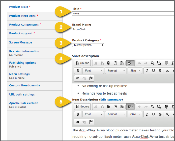
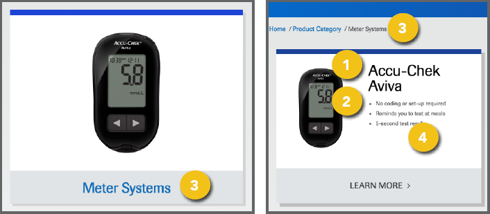
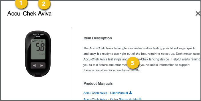
To add a new Accu-Chek product to the 1. Title: Enter the product name and 2. Brand Name: Enter “Accu-Chek” (or in 3. Product Category: Select the default ! To add or edit product categories, select 4. Short Description: This appears on the 5. Item Description: This text will appear |
|
|
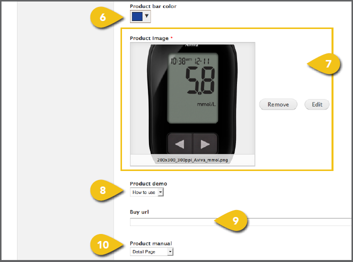
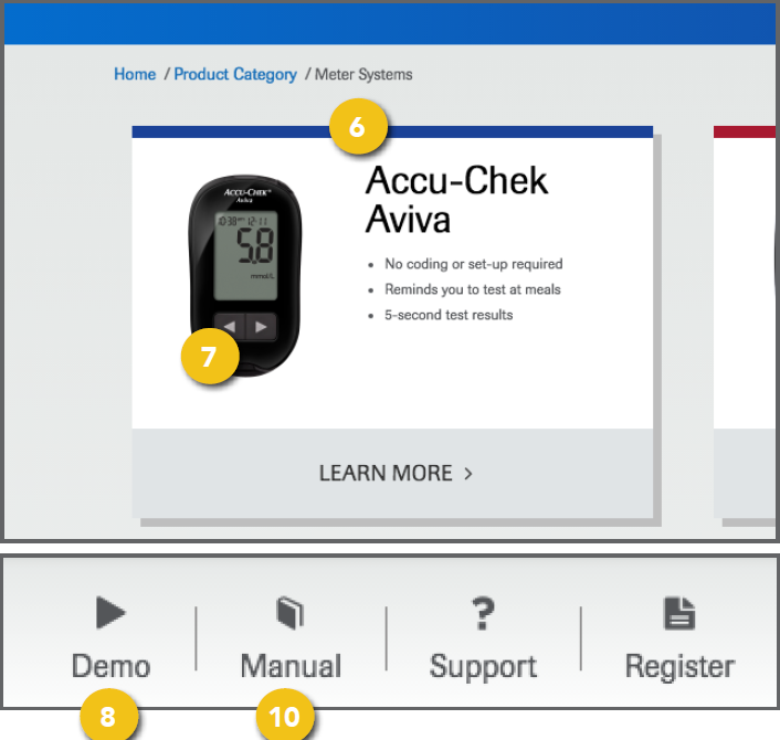
6. Product Bar Color: This appears across • Enter a hex color code in the text field and click Choose. It is preferable to enter the hex values in the field provided, to make sure the colors appear correctly on all monitors and devices. • If necessary, you can select a color by sliding the bar in the right column 7. Product Image: Select an image for the ! Use an image with a resolution of at least 8. Product Demo: If you have a demonstration video, you can add it here and a Demo link will automatically be placed at the top of the page. If you have no video, select None. To include a video, select one of the following. • How to Use: The link at the top will • URL: The link at the top will direct to a 9. Buy URL: This module is currently inactive. 10. Product Manual: If you have an owner’s
|
|
|
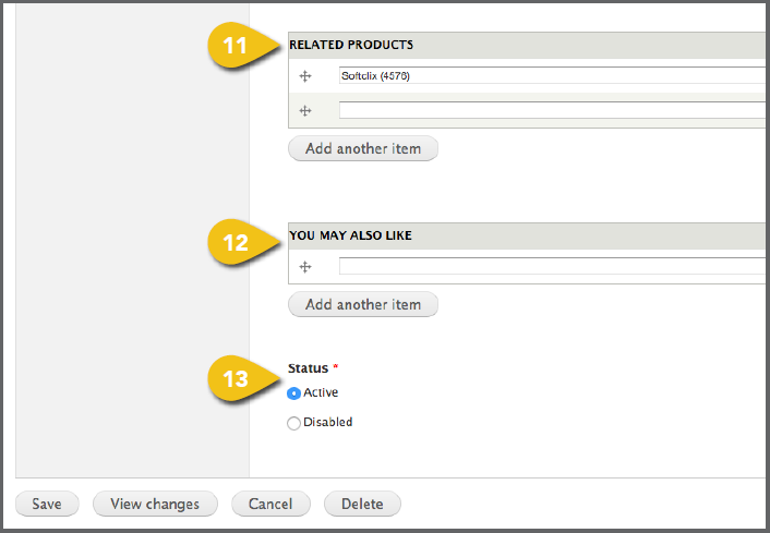
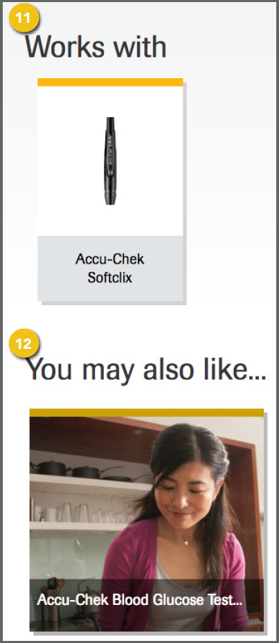
11. Related Products: Enter additional • Begin typing the name of a product • Select the desired product. • To include multiple related products, 12. You May Also Like: This can be used for • Begin typing the name of an article • Select the desired article. • To include multiple related articles, 13. Status: Choose Active to display the |
|
|
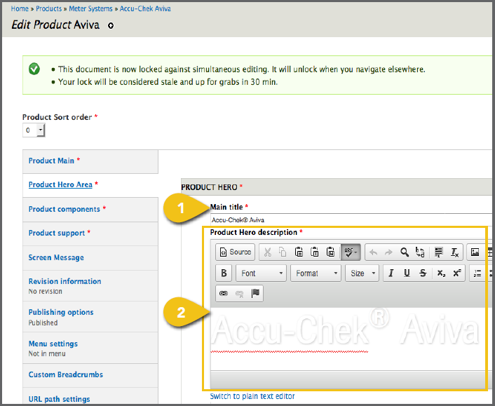
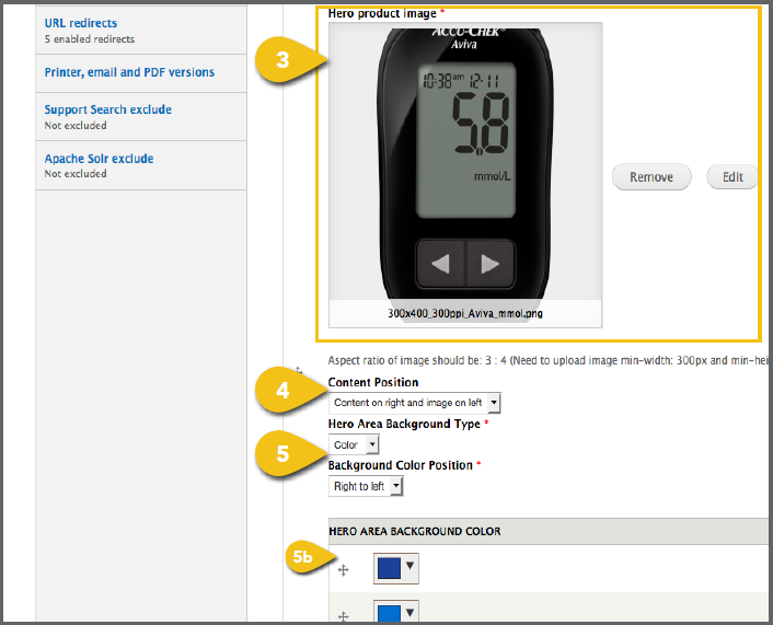
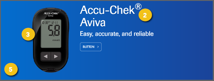
1. Main Title: Enter the full product name, 2. Product Hero Description: This text 3. Hero Product Image: Select a product ! Use an image with an aspect ratio of 3:4. If you use an image with another aspect ratio, it may be stretched or skewed when it appears on screen. 4. Content Position: Select whether you want text to appear to the left or right of the product image. 5. Hero Area Background Type: Choose a Color or Image. a. Image: Visit Add an Image for detailed ! Use an image with a resolution of 1366x480. b. Color: If matching a product brand • Background Color Position: The • Background Color: You can include |
|
|
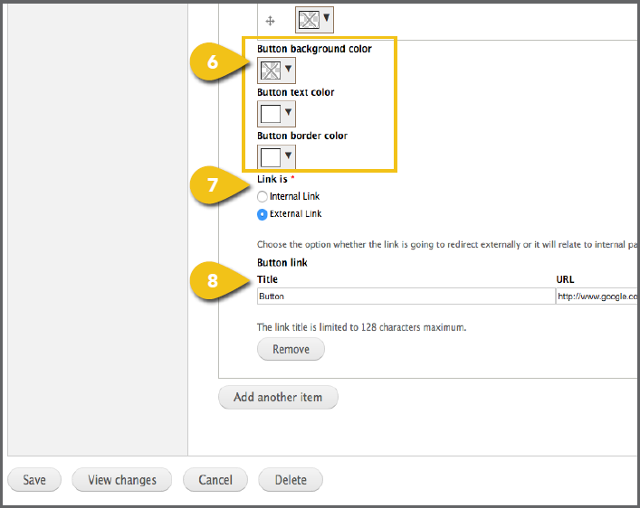
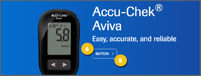
6. Button Background, Text and Border 7. Link Is: Identify whether the link 8. Button Link Title and URL: If you are including a link, add text and the |
|
|
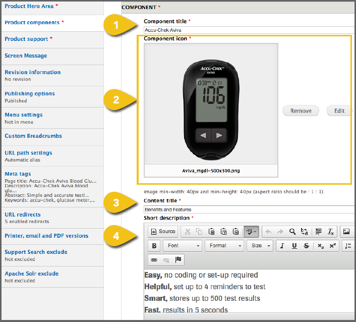
1. Component Title: Enter the full product 2. Component Icon: To include icons with various components, visit Add an Image for ! Use an image with a minimum resolution of 40x40 and an aspect ratio of 1:1. If you use an image with another aspect ratio, it may be stretched or skewed when it appears on screen. 3. Content Title: This text introduces 4. Short Description: This copy should |
|
|
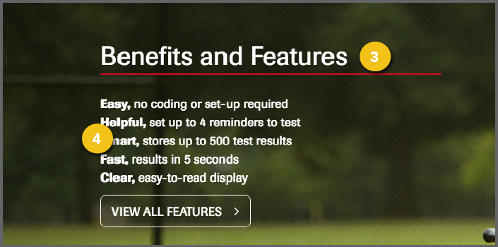
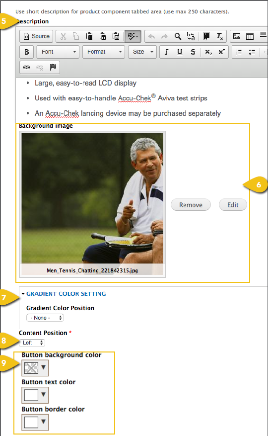
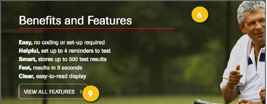
5. Description: This bulleted text appears 6. Background Image: This image appears on the product landing page behind the Short Description noted above. Visit Add an Image for detailed instructions on choosing an image and entering the information required. ! Use an image with a resolution of 1366x480. 7. Gradient Color Setting: Gradient Color 8. Content Position: You may place text on 9. Button Text, Background Color, Text Color and Border Color: The global standard for these items is white with no background. However, these can be |
|
|
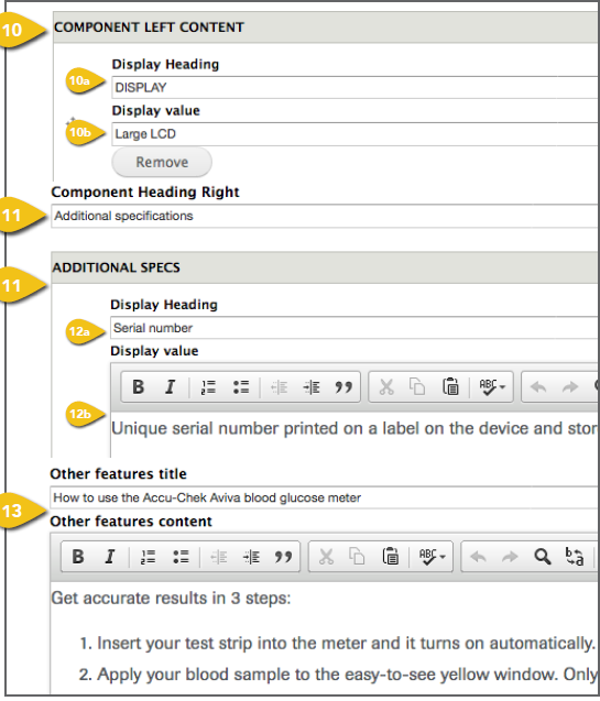
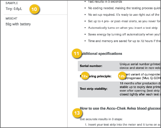
10. Component Left Content: This sidebar on the product detail overlay is designed to a. Display Heading: This text introduces b. Display Value: This text provides 11. Component Heading Right: This text introduces the specifications shown in the gray and white bars at the bottom of the product detail overlay. The global standard is “Additional specifications.” 12. Additional Specs: Enter detailed information a prospective customer might be interested in. Continue to click Add a. Display Heading: This is the b. Display Value: This is the productspecific 13. Other Features Title and Description: |
|
|
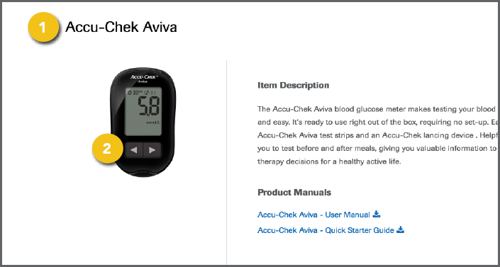
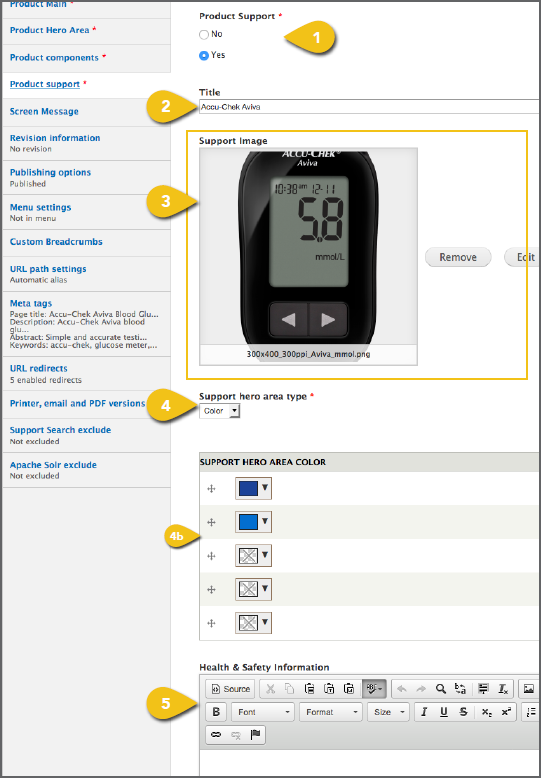
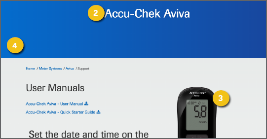
1. Product Support: Select Yes for any 2. Title: Include Accu-Chek and the product 3. Support Image: Select a product image to appear on the support page. Visit Add an Image for detailed instructions on choosing ! Use an image with an aspect ratio of 3:4. If you use an image with another aspect ratio, it may be stretched or skewed when it appears on screen. 4. Support Hero Area Type: You may choose a. Support Hero Area Image: Visit ! Use an image with a resolution of 1366x480. b. Support Hero Area Color: Include the darker shade of the brand color, followed by the primary brand color, and a gradient 5. Health & Safety Information: Include any |
|
|
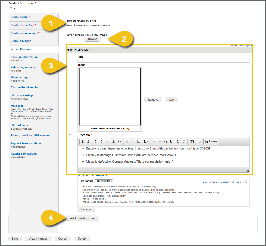
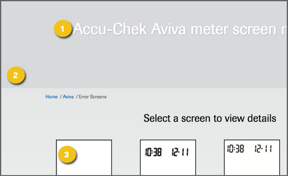
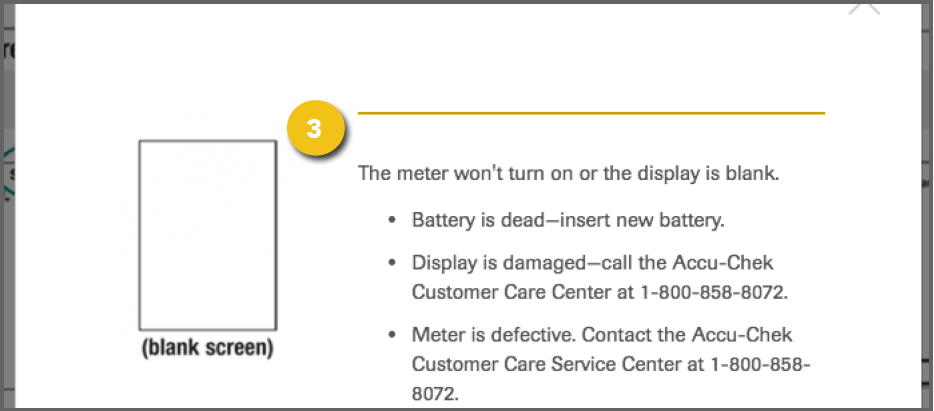
1. Screen Message Title: You may enter a 2. Error Screen Hero Area Image: You may include a general image here, or leave blank. Visit Add an Image for detailed instructions on choosing an image and entering the information required. ! Use an image with a resolution of 1366x480. 3. Screen Message: For each screen ! Use an image with a resolution of 160x225. 4. Continue clicking Add Another Item until |
|
|
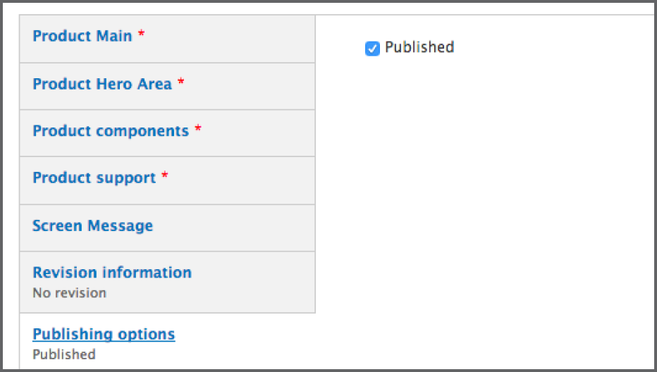
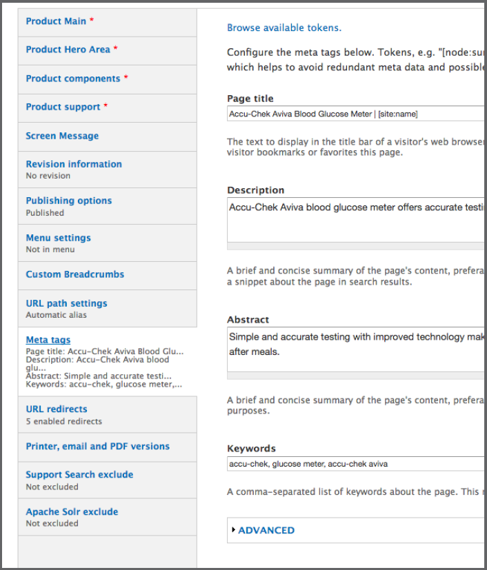
Additional Content Get step-by-step instructions for the remaining options, including Revision Information, Publishing Options and Menu Settings in the Additional Content Details section. Meta Tags Add page and content Meta Tags that Save Save your work by clicking the Save button at the bottom of the navigation pane. |
|