|
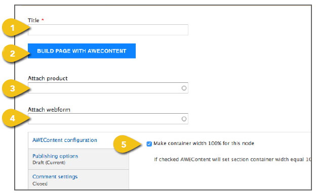
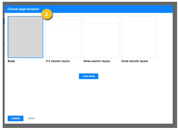
The WCMS uses a plugin called AweContent to allow you to create dynamic pages with greater design freedom and functionality than the product, article or other templates. Select Create a Template under Dynamic Layout Page from the Manage Content dropdown to get started. 1. Title: Enter a title for the page. 2. Build Page with AweContent: Click the button to open an AweContent window. Select a page template then click Choose to begin building, then refer to the AweContent Interface section below for additional direction. ! Choose Blank to build for the greatest flexibility. Selecting a predesigned template doesn’t save a lot of time, and you will not be able to remove any sections you don’t need. 3. Attach Product: Begin typing a product name in the text field. As you type, a list of possible matches will appear. Select the desired product. If you don’t see what you’re looking for, continue typing and the list will refresh. 4. Attach Webform: Begin typing a webform name in the text field. As you type, a list of possible matches will appear. Select the desired form. If you don’t see what you’re looking for, continue typing and the list will refresh. 5. AweContent Configuration: When selected, the AweContent section container width will be set to 100%. When unselected, the section container width will default to 1170px. |
|
|
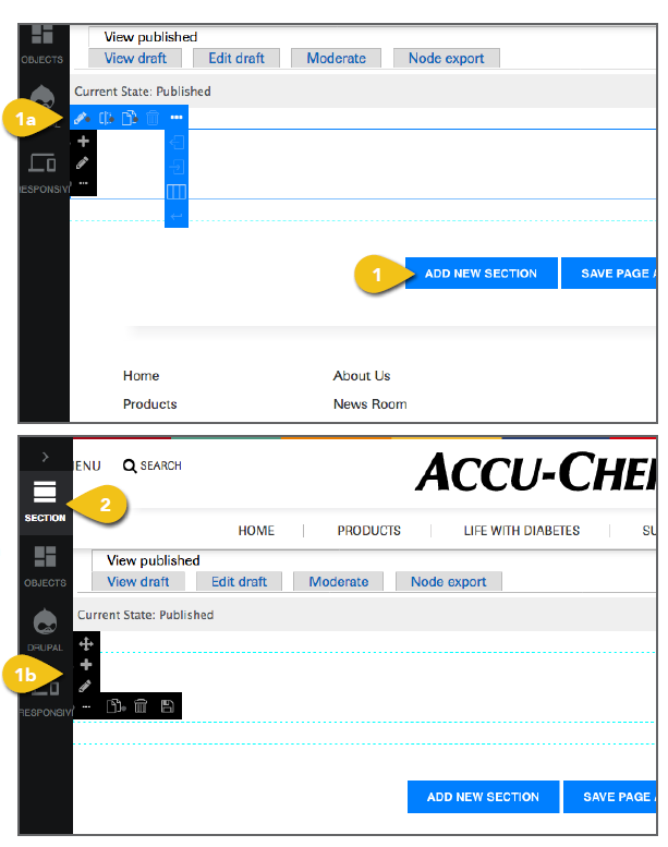
AweContent Interface Once you have selected Build Page with AweContent and opened a new window, you can begin adding and configuring your own content. 1. Add new section: Click this button to add a new, empty content block. As you hover over the block, you’ll see section and column setting interfaces. a. Column Settings: The blue column settings interface includes: 1. Custom column—click change settings including ID and class, alignment, height, border, background and more. 2. Split column into 2 columns 3. Clone column. 4. Delete column. 5. Decrease Indent one bootstrap column unit per click. b. Section Settings: The black section settings interface includes: 1. Drag and Drop to change the section order. 2. Add Column to a section. 3. Custom Section—click and custom section panel will open on the left where you can change settings such as: ID, class, attribute, row spacing, padding background and more. 4. Clone section. 5. Delete section. 6. Save and name section to use in another node. 2. Section Icon: Access your saved sections here. |
 |
|
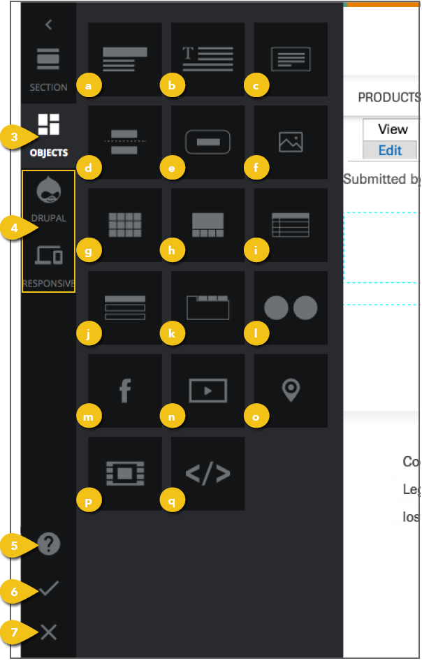
3. Objects Icon: Drag icons into page sections to create your page and configure content. You can move most items around simply by dragging them into place. a. Header: Enter and style header text for the page or a section. b. Text: Enter and style text within a section. c. Message: Select styles for warnings, informational messages or Success for confirmation text. d. Divider: Add a section divider with text. e. Button: Create a custom button. f. Image: Place an image where and how you want it to appear. g. Gallery: Insert and style multiple images in a grid or band. h. Slideshow: Include an auto play or user-controlled slideshow. i. Table: Drop in a predefined table. j. Accordion: Easily create an accordion for expanding content. k. Tabs: Specify a tabbed content insert. l. Flickr: Embed a Flickr album of images in your own template. m. Facebook Like Box: Embed a Facebook module and customize so users can view posts, Like your page, and more. n. Video: Add a video or animation to support page content. o. Google Maps: Embed a map and the ability to access directions. p. iFrame: Use inline frames to embed another file within the page content. q. HTML Code: Create an open section that allows HTML code to be entered. 4. Drupal and Responsive Icons: These items should not be changed. 5. Support Icon: Watch video tutorials or ask questions within a user forum. 6. Save Icon: Don’t forget to click the check mark to save your page. 7. Cancel: Click the X to return to the main template page without saving. |
 |
|
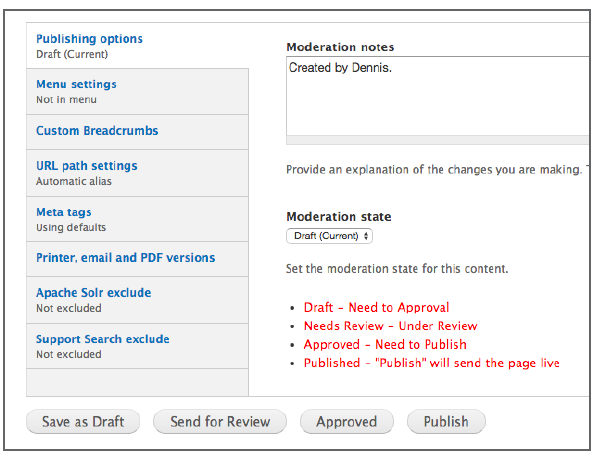
Additional Content These tabs appear beneath the primary content fields in the template. Get step-by-step instructions for the remaining options, including Publishing Options and Menu Settings in the Additional Content Details section. Meta Tags Add page and content Meta Tags that incorporate popular search terms to aid in search performance and user access. See Meta Tags for additional detail. Save Click the Save button beneath the navigation pane to save your work. If you have checked Published under publishing options, this will send the page live. You may also Preview your work before saving. |
 |